It’s been awhile since I shared my Project Life pages on the blog and I’m doing things a little differently for 2017 so I thought it was time for an update! This is my seventh year using Project Life to document my family’s story. Every year I select ONE core kit to use for the entire book. This helps limit design decisions (major time saver!) and makes my entire book blend together beautifully. For 2017, I selected the Explore Edition.
This year, the “big” change in my approach to our Project Life pages is that I’m make MONTHLY spreads instead of weekly spreads. For the last six years I’ve always, always made a spread for every week. [I’ve used the Project 52 kits that have title cards for every week- you can see page examples here]. This year, I was feeling a ‘less is more’ vibe and wanted to focus on taking fewer photos in favor of being more present in the moment. I decided to try monthly pages, where I could make 2-3 spreads per month based on how many photos I had. This removes the pressure of taking ‘enough’ photos or daily photos.
It’s easier to just show you what I’m talking about… here’s a peak into my 2017 album using MONTHLY spreads.
project life pages using monthly spreads
I start each month with a title card that lists the month name (see January below). Then I design page spreads with my favorite photos + stories from that month. On the following pages I don’t use title cards or dates. January included 3 total page spreads. Take a look:
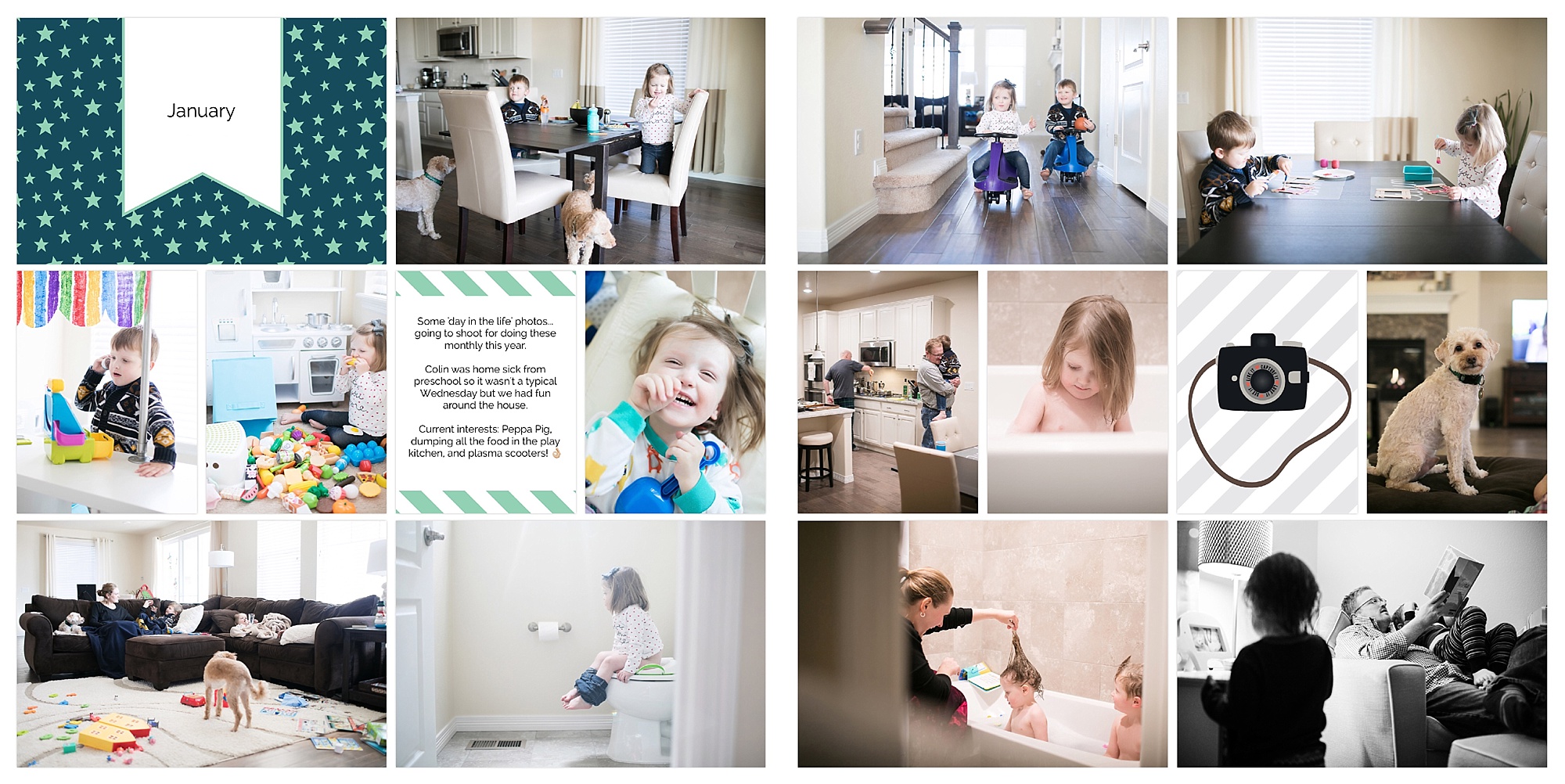
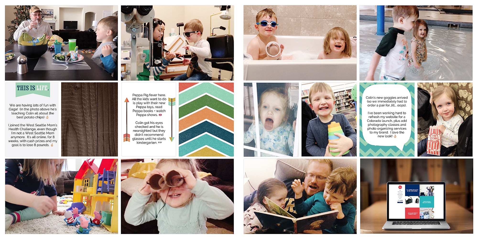
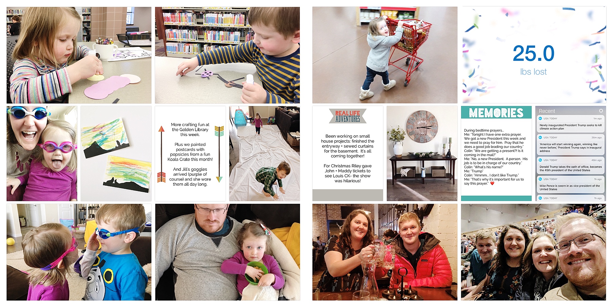
Here’s another example from the month of March. I’m finding 3 page spreads per month seems to be my ‘magic number’ but I’m open to more/less if that’s what I need for a specific month.
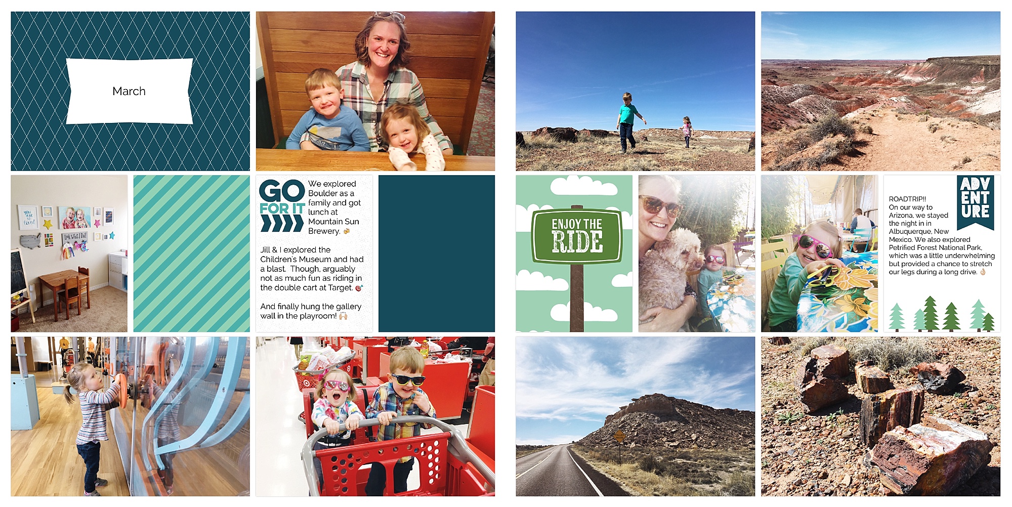
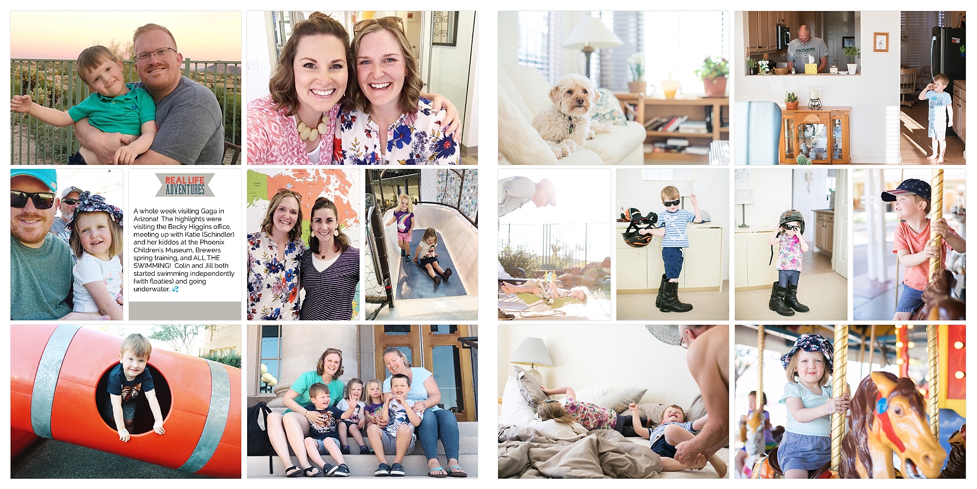
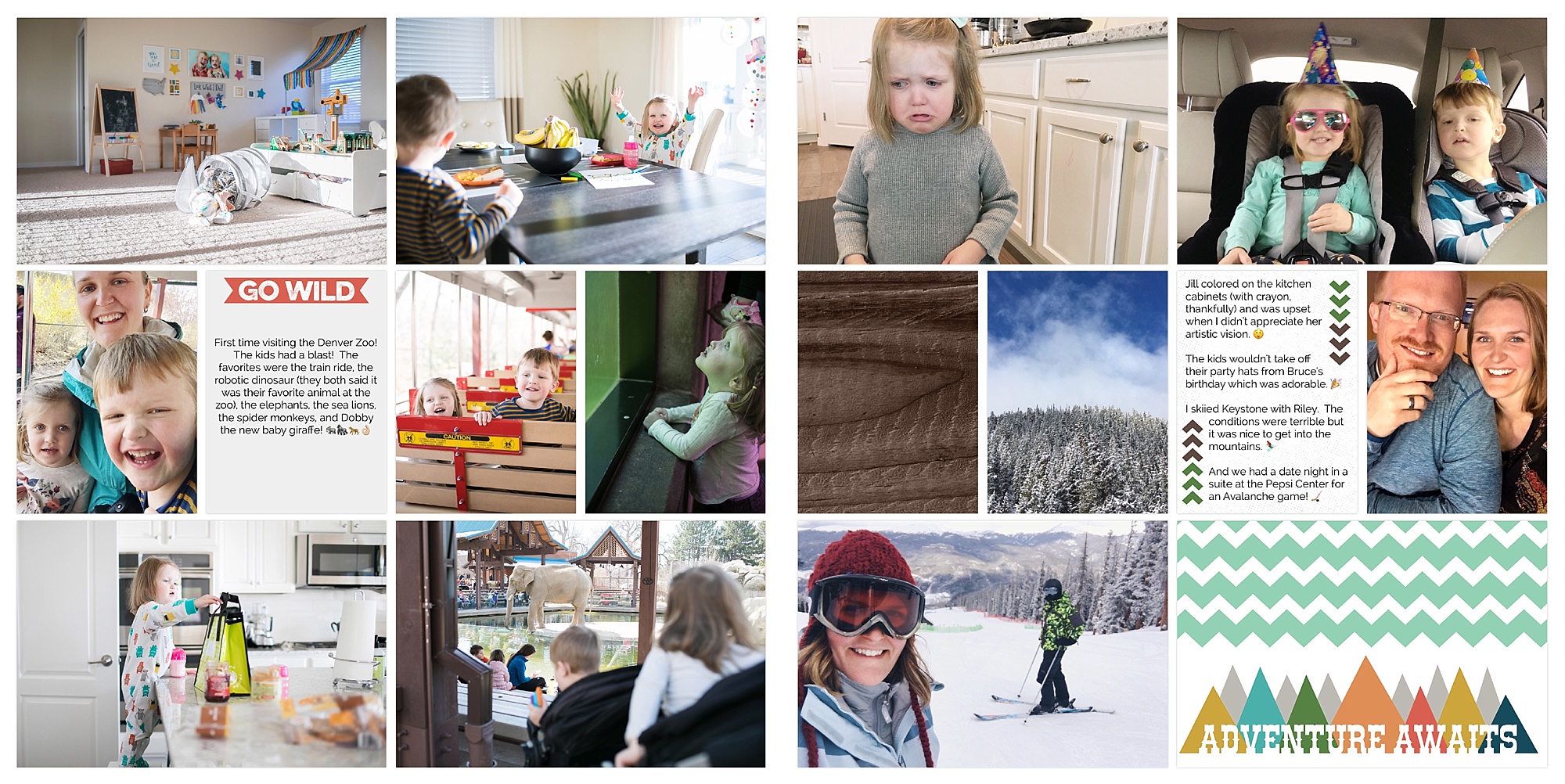
Here’s an example of how I handle a vacation. I use another title card and label it with the destination. So, in a month where we take a vacation, I’d still use a title card to list the month, then I’d include this as a following spread. Like spread 2 of 3, if that makes sense.

Overall, I’m loving the monthly approach. I’ll have fewer pages at the end of the year, but they’ll be packed with only our favorite photos and stories and not the filler. I’m going to keep it up for the rest of 2017, for sure, and then I’ll share another update on how it turned out!
Want more? Here are some additional helpful Project Life posts:
- Here’s a step-by-step tutorial of how I print my annual yearbooks with Blurb.
- I’ve been using the same basic cover design for our family albums. I shared a free photoshop template here.
- I wrote about my favorite apps to use in conjunction with the Project Life App in this post.
- See ALL of my Project Life related posts here.
Want to use the Project Life App for your family yearbook? JUST START! Download the AMAZING app or order a physical kit or buy a digital version (for photoshop).