This year I’ve been devoting one week a month to a themed blog series, with daily blog posts. I’ve talked all about project life, shared some ‘wish someone told me sooner’ parenting advice, written about ways to preserve your memories/photos, revealed our favorite things in West Seattle, and this week is ALL ABOUT PHOTO EDITING!
When Instagram came along, everyone [myself included] started going crazy with editing their phone photos. It was so easy to pick a filter and achieve a look. My only complaint was that a lot of the ‘looks’ were too dramatic, trendy & detracted from the photo. Thankfully Instagram now allows you to decrease the intensity of the filters, but I look back at many of my photos from this timeframe and cringe a little at the way they were ruined (obviously at the time I thought I was in fact making them better). They’re so far from the clean & simple style that I prefer now.
I learned the lesson that it’s important for my photos to be timeless and not trendy. Over time I’ve better defined my style for editing on my phone. I have found two third-party photo editing apps that have helped me achieve this look consistently, without requiring too much time.
tips to edit photos on your phone
Quick tip: Before you start editing, check your screen’s brightness setting. If I’m in normal lighting conditions, I like to set my brightness at 50% before I alter my photos.
App #1: A Color Story
A Color Story is relatively new on the scene and was developed by A Beautiful Mess (I’m a long time lover of their Happy Mail subscription). I love this app for its ability to manage color. It brilliantly whitens whites and pops colors without adding any muddy tones to the image.
You guys… this app is FREE (with options to purchase additional filter sets). Honestly, I find myself using the filters that are included in the free pack most frequently though. My favorites are: Pop & Everyday (in the free Essentials kit), Punch (from the Blush kit), Tulip (from the Fresh kit) & Picnic (from the Airy Kit).
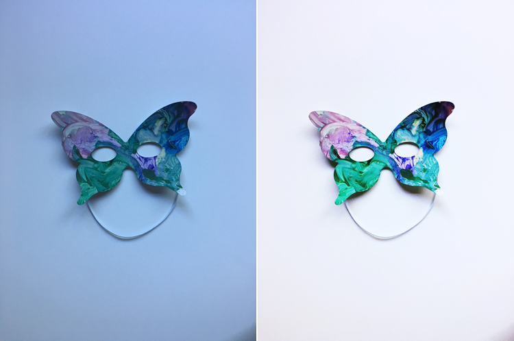
Here’s an example of the app’s ability to whiten white & pop colors. I take photos on white posterboard of all Colin’s artwork (more on that in a future post) and the original photo always stinks. I use the Pop filter in A Color Story (usually at 100%) to fix the image. For this photo in particular, I ran Pop twice.
A Color Story is my go-to app for any images that are bold, bright & colorful. It will accentuate those features with a quick click. This photo of Colin at the race track was edited with Everyday (part of the free Essentials kit).

App #2: PicTapGo
PicTapGo was developed by Totally Rad, a company who knows a LOT about making photo editing quick & easy (they make great Photoshop actions/tools). I’ve been using this app for many, many years now and it’s what I use for most of the personal photos I share on social media. My favorite filters are Lights On, Brightside, Air, and the Replichrome Kit (available as an additional purchase).
I use PicTapGo when I want a softer, more natural feel versus the dramatic, bold colors I achieve with A Color Story.
This photo of Jill on the ferry was edited with Lights On and P 160NC (from the Replichrome kit).

I like using PicTapGo when I have a dark image that I want to brighten significantly. The photo below was edited with Lights On, Air, and P 160NC (from the Replichrome kit).

There you have it… my main tricks & favorite apps to edit photos on your phone! Once you get familiar with the apps and learn your favorite filters, you can truly edit your photos in a quick click. So easy!
More photo editing tips & photoshop tutorials are coming all week long! If you’d like to receive a summary in your email inbox at the end of the week, enter your email address here!