

One really common mistake that’s made when editing photos is over saturation. With the prevalence of filters, this is really easy to do…. take a photo, slap on a filter, and post it on social media. (Only to realize months or years later that the photo doesn’t look anything like the real moment and you wish you hadn’t edited it that way.)
Over saturation can be really distracting in a photo. In the example below, you don’t even notice my son riding his bike because you’re so distracted by the crazy blue of the sky and the glowing green of the grass.
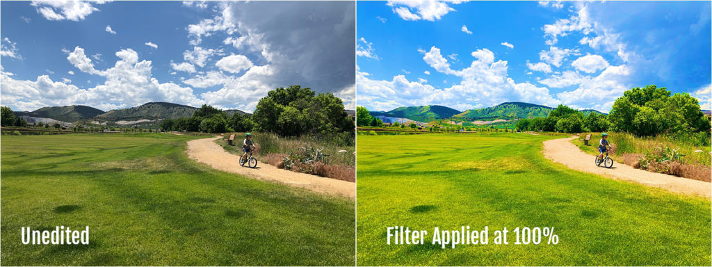
This problem is easily avoided by asking yourself the question: Do the colors look natural? If the answer is no, consider applying a different filter or lowering the intensity of the filter.
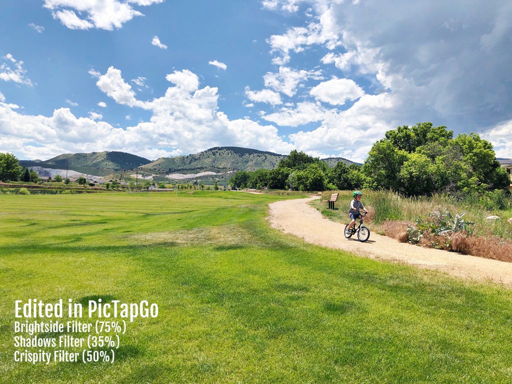
Here’s a video demonstrating how I achieved a much more subtle + natural edit on the same photo while using filters in the PicTapGo (just with a lower intensity this time!):
And here’s the final result:
Want more photo editing tips?
Don’t miss my brand new editing courses!
My Basic Photo Editing for Lightroom course will teach you how to transform your images on Desktop + Mobile (using the Lightroom program).
My Basic Photo Editing on your Phone course includes tutorials for achieving natural, timeless edits using free (or almost free) apps available on iPhone and Android.


