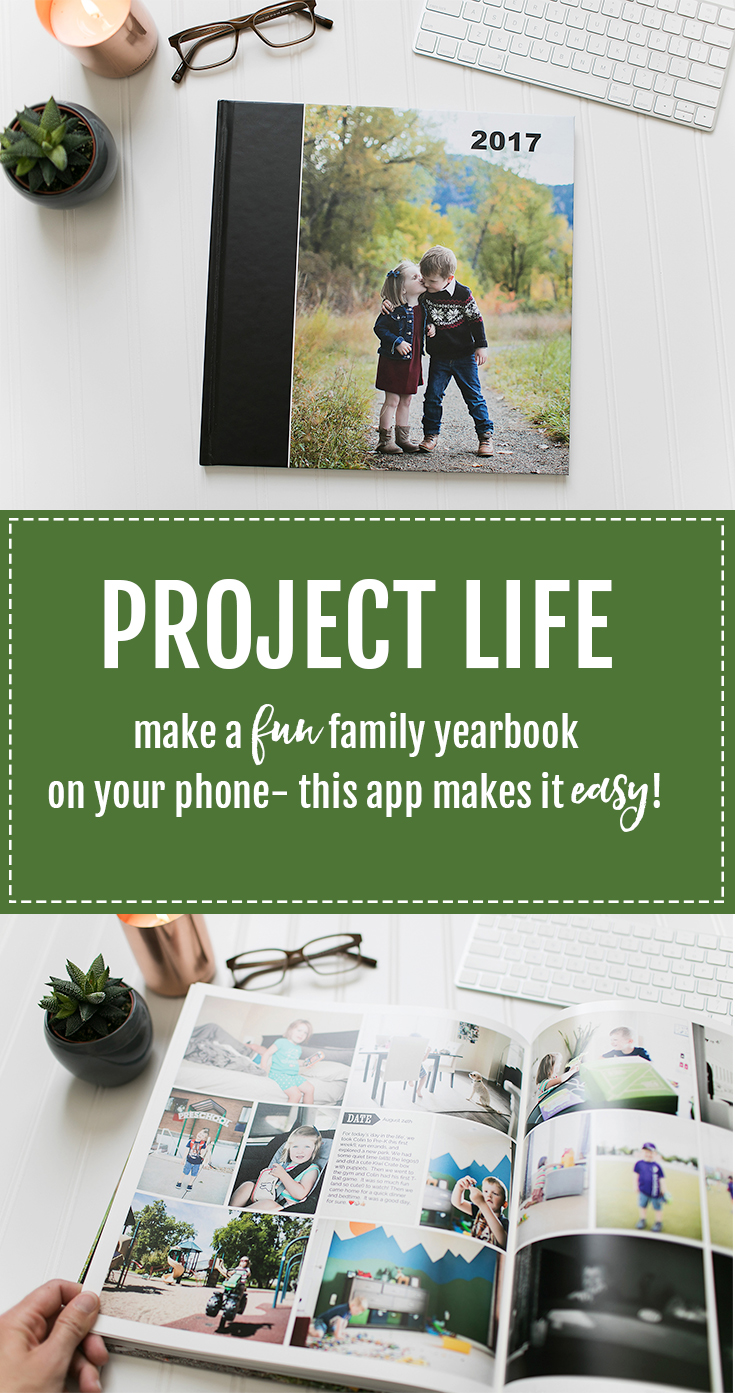
Ok, you probably already know that my love for Project Life runs deep. I’ve been using this simple system to document my family’s story for seven years now. Can’t stop, won’t stop. Getting my photos off my phone and into the hands of my family brings me so much joy.
If you’re new here, Project Life is a simple way to use your photos coupled with a little journaling to tell the story (so much better than a regular photo album!) resulting in a stunning family yearbook. I make one every year for my family and I love knowing that I’m doing something with my photos. Here’s a peek at the finished product for 2017…
OUR 2017 FAMILY YEARBOOK MADE WITH THE PROJECT LIFE APP
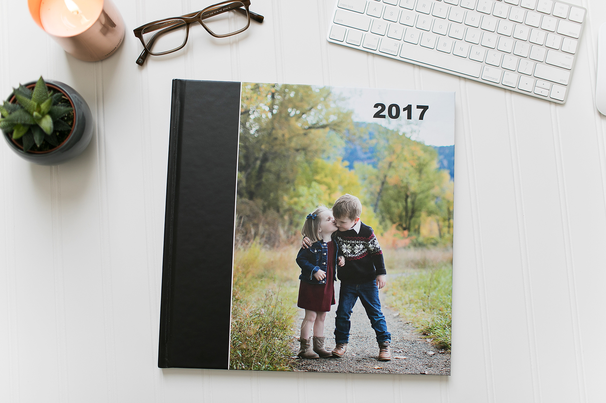
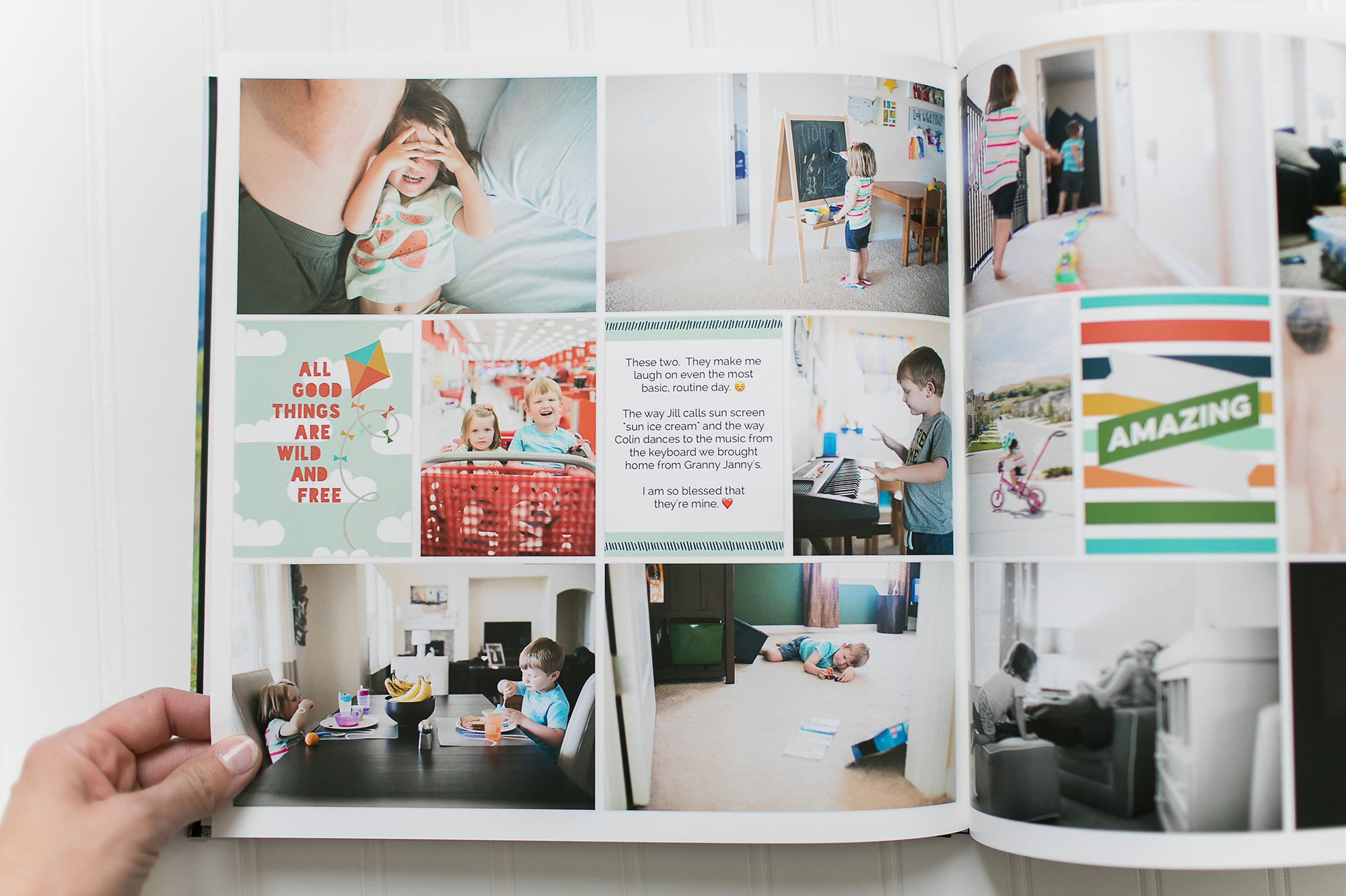
This year I shifted my approach to our family yearbook. Rather than creating a page spread (left + right page) for EACH WEEK of the year (peek into 2016’s book to see an example), I made my pages BY MONTH this year. This small change brought so much more freedom and flexibility. Rather than feeling ‘forced’ to fill the pages every single week, I could focus solely on the photos that mattered most to me and drop the fluff.
I began each month with a title card (January is shown below), then I filled the pages with photos, journaling cards, and filler cards until I included all the photos that meant most to me. My months typically consisted of 6 pages (3 spreads), but there wasn’t a set rule- I love the flexibility! On a busy month, I could include 8 pages! On a quiet month, I could include 2 pages. I love this monthly method!
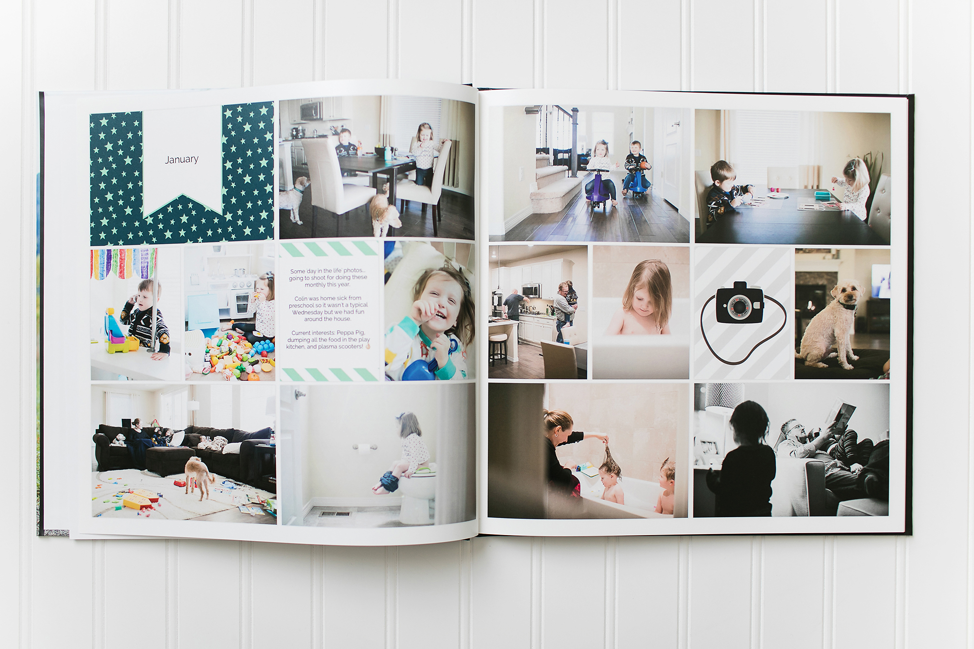
Each year I select ONE design kit to use for every single page of the year. This minimizes the required design decisions, makes it SO MUCH FASTER to pull the pages together, and results in a finished book that beautifully coordinates throughout the entire year. For 2017 I used the EXPLORE kit (note: this link takes you to the physical kit where you can see the designs, but I do everything in the Project Life App).
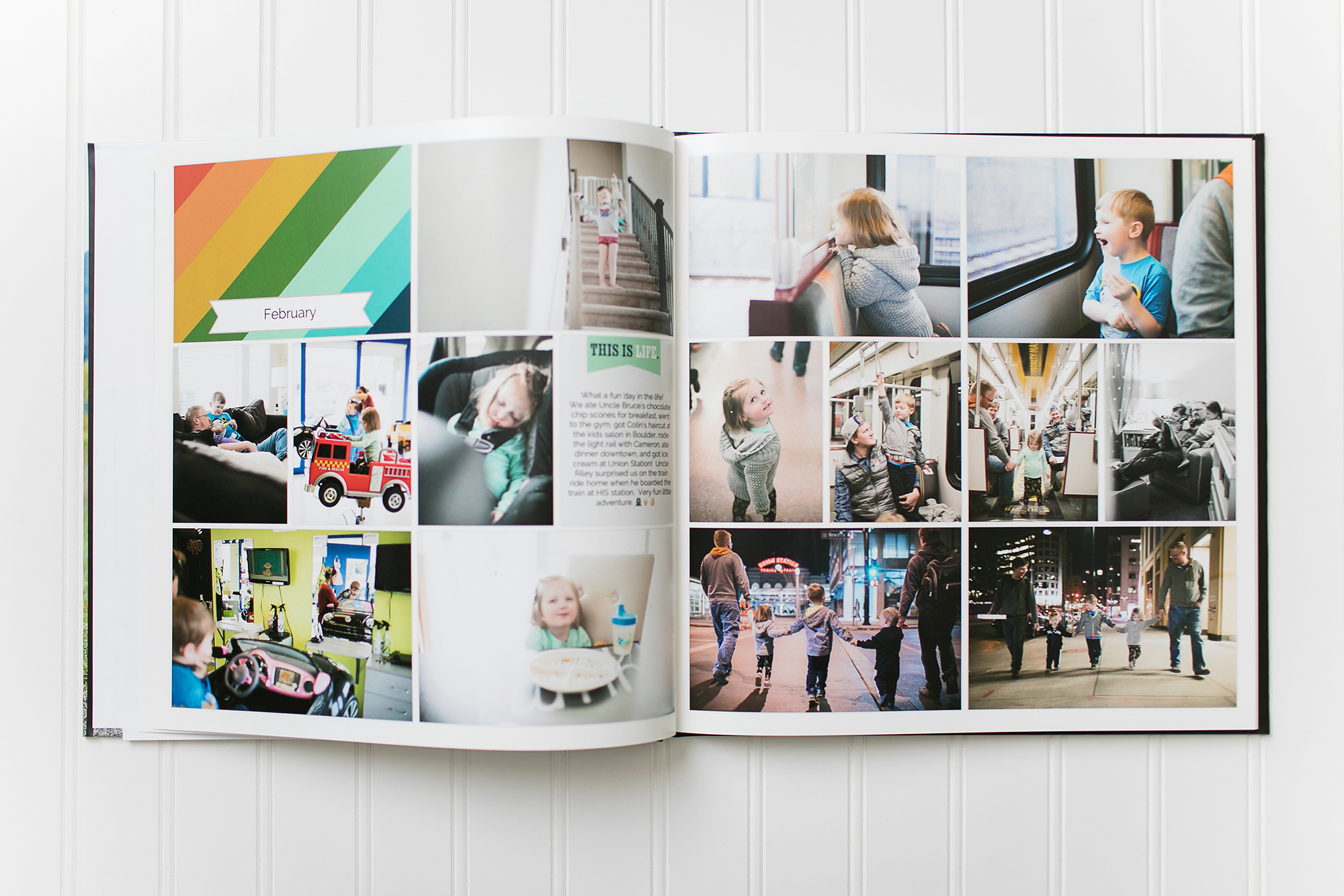
Another new thing I tried this year was a monthly ‘day in the life’ where I used my big camera to document our daily lives. These pages are my favorites because the photos are so cohesive and tell a beautiful story, even though they’re such basic moments. On these ‘day in the life’ spreads, I include one journaling card and share the details of the day.
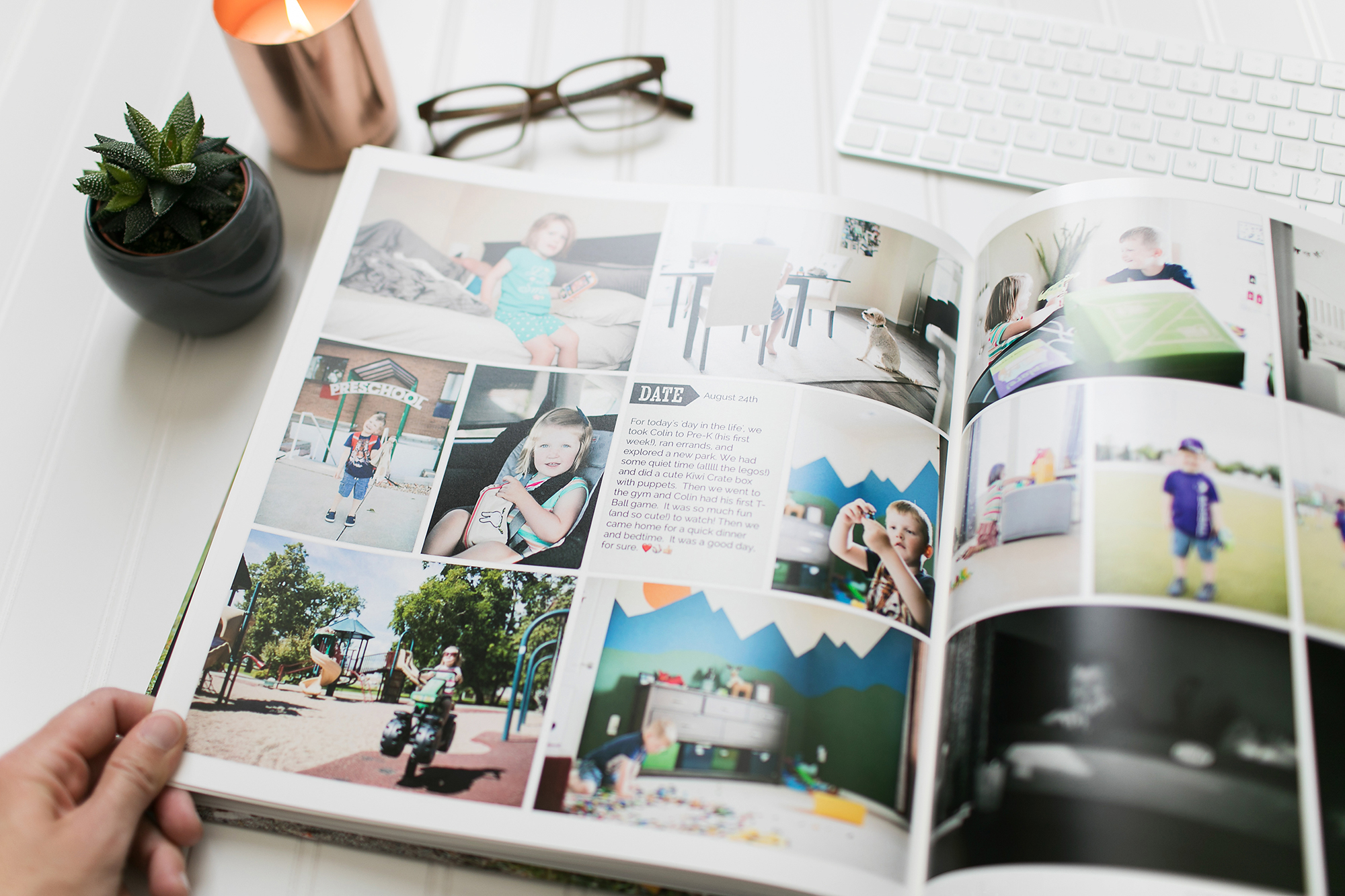
I printed my finished book with Blurb again this year. It’s a 12×12 hardcover book. I tried their Proline Pearl Photo Paper for the first time (I’ve used Proline Uncoated in the past) and I LOVE IT SO MUCH!! (You can see my quality comparison of seven different books here and my tutorial for printing with Blurb here).
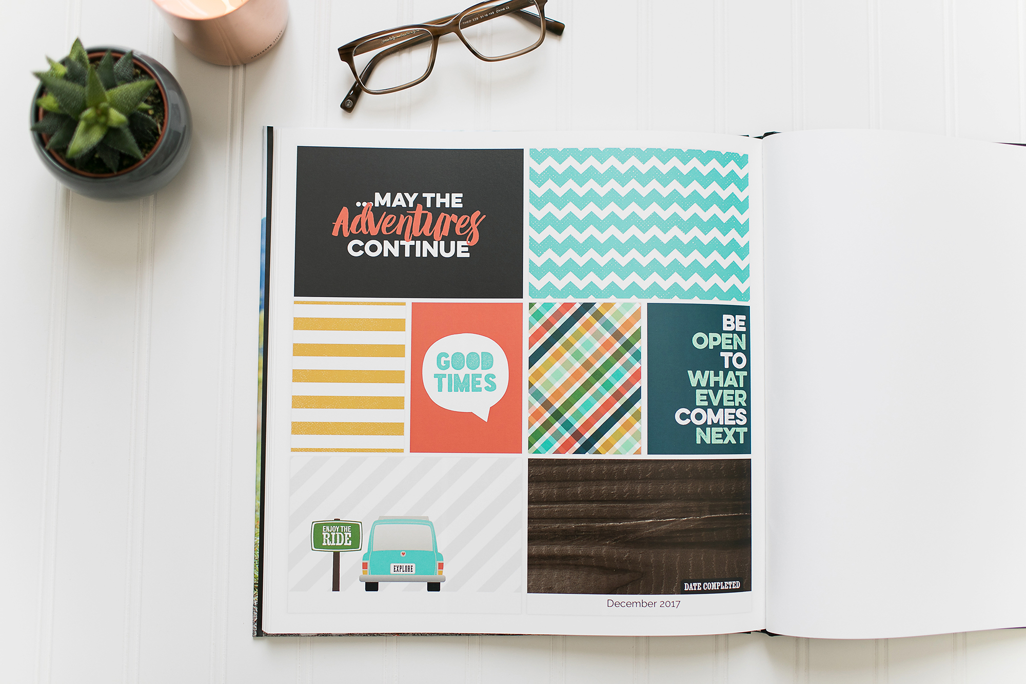
This year’s finished book was 74 pages total (including a first + last page… last page is shown below). All of our prior yearbooks created with the weekly format were 106 pages. I have to say… I think 74 feels like the perfect size! Honestly, I wish I’d switched to this monthly approach sooner!
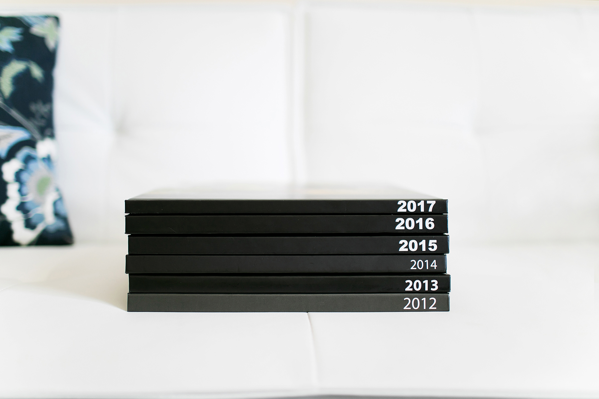
Like I said, this wasn’t my first rodeo- it was my seventh printed yearbook. Here are a few tricks I’ve learned over the years…
TIPS FOR USING THE PROJECT LIFE APP
- Keep it simple. Pick ONE design kit and ONE page template for the entire year. Select a single font and keep it consistent through the entire book. You can design your pages so much faster when you’re making fewer design decisions.
- Set your Preferences. From the home screen, tap on the Question mark. Select Preferences and set your default font size, page template, etc. This will automatically populate on every new page you make… SUCH A TIME SAVER!
- Favorite your Photos. Use your ‘favorites’ function in the Camera Roll (tap on the heart icon) to decide which photos you want included in your album. Before I make my pages, I scroll through my photos and tap the ‘heart’ on the ones I love. Then, inside the Project Life App, I select the favorites photo album and ONLY the photos I’ve pre-selected show up. SO MUCH FASTER.
- Don’t overthink it. There is no ‘right way’ to do Project Life. Time spent overthinking isn’t productive. Remember that DONE IS BETTER THAN PERFECT.
- Just start. Don’t let yourself get hung up on the past and playing ‘catch up’. Just jump in! It’s the only way you’re going to get a finished book in your hands!
Want more? Here are some additional helpful Project Life posts:
- I’ve been using the same basic cover design for our family albums. I shared a free photoshop template here.
- Here’s a step-by-step tutorial of how I print my annual yearbooks with Blurb
- Or use this FREE Photoshop template to add borders to your pages and print it anywhere you like!
- See ALL of my Project Life related posts here.
