It’s been awhile since my last project life update so I thought I would share a couple pages from the last few months. I’ve talked many times about how I use the Project Life App to quickly & easily design my pages on my iPhone. It’s the best. Even though the app/my phone is with me at all times, I tend to make my pages in batches. Every 2 months or so, I spend a couple hours creating pages for the past weeks. I get into a groove and find it’s easier for me to do it all in one power session, than to try to do it as a weekly activity. (But to each their own!)
a simple project life app tip…
My favorite trick for designing pages quickly? Before you start working on a page, go through all your photos and mark the ones you’d like to include in your Project Life as ‘favorites’ (by clicking the heart underneath the photo). Then, when you’re in the Project Life App, you can simply reference the ‘Favorites’ album and see ONLY the photos you wish to include! Saves me lots of time!
Anyway… here are a few of my favorite pages from the last few months (using the Project 52 design kit).
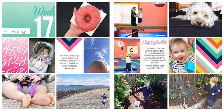
April 27 – May 3. I love the colors of the Project 52 design. So fun & bright & they always seem to coordinate perfectly with my photos. This week in particular was a mix of activities… classes at The Little Gym… planting the garden… celebrating the opening of Top Pot in West Seattle.
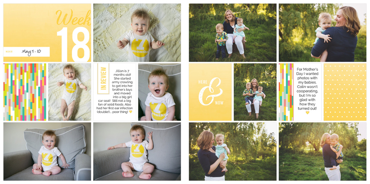
May 4 – 10. I divided this week into two ‘events’ and left out our random day-to-day snapshots. I focused on Jill’s 7 month photos and my mommy & me mini session with the kids (by Brigette Rebol).
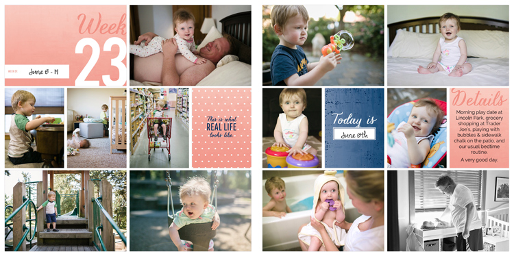
June 8 – 14. This week features our day in the life. These weeks always tend to be my favorite spreads because the photos are a higher quality (taken with my ‘big camera‘) and the pages have a more polished feel.
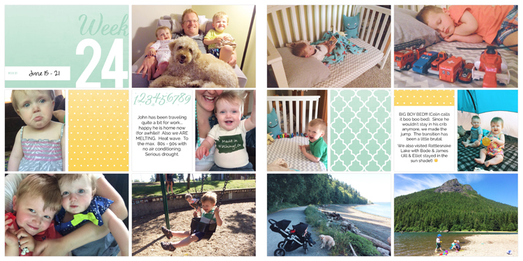
June 15 – 21. Lots of random snapshots this week. My favorite is the photo of John with all THREE smiling kids (after he returned from a work trip). This was also the week we transitioned Colin to a big boy bed so there are a couple photos documenting that milestone.
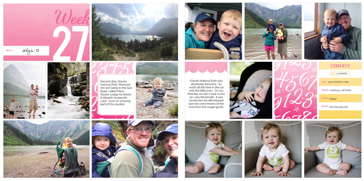 July 6 – 12. This was our trip to Glacier National Park. There were SO many photos I wanted to squeeze into this spread so I used a different page layout on the right side that let me incorporate a few extra photos.
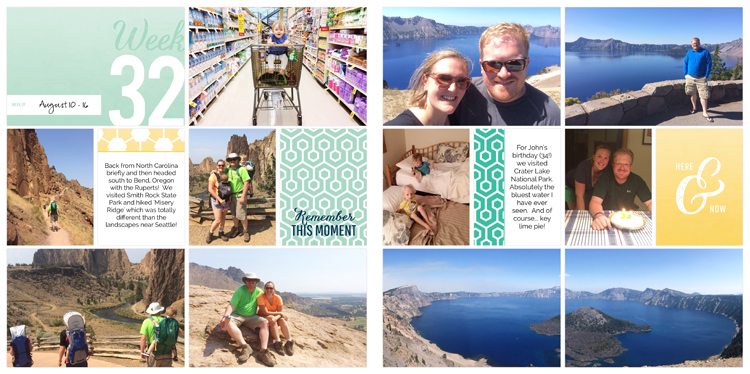
August 10 – 16. This was our trip to Bend, Oregon. I got a little creative on the right page and used a panoramic photo because it better showcases Crater Lake. I did this by adding the same photo into both pockets and adjusting them until they lined up & looked like one consistent photo.
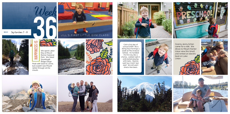
September 7 – 13. This week was primarily focused on our visit(s) to Mount Rainier & Colin’s first day of preschool. Sometimes I like to use another app to add text onto my photo (like the one of Jill at her first Little Gym class). There are lots of apps that do this… I personally use Over… but I have a suspicion that this will be an enhancement in the Project Life App eventually (woot!).
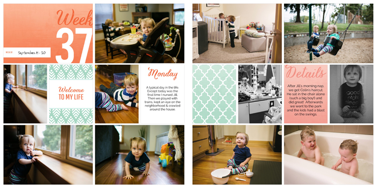 September 14 – 20. Another spread featuring photos from our day in the life. Lots of great designs in the Project 52 kit for this purpose.
want to start using the project life app? it’s never too late!
- The AMAZING app is my favorite, but you can also order a physical kit or buy a digital version (for photoshop)!
- I shared how I print my digital pages into beautiful bound books in this post.
- See all of my Project Life related posts here.